TZ Flex Grid
TZ Flex Grid is a module with smart grids which is responsive with flexible and beautiful style.
TZ Flex Grid is a module with smart grids which is responsive with flexible and beautiful style.

They will adapts automatically on all devices, all screen size.
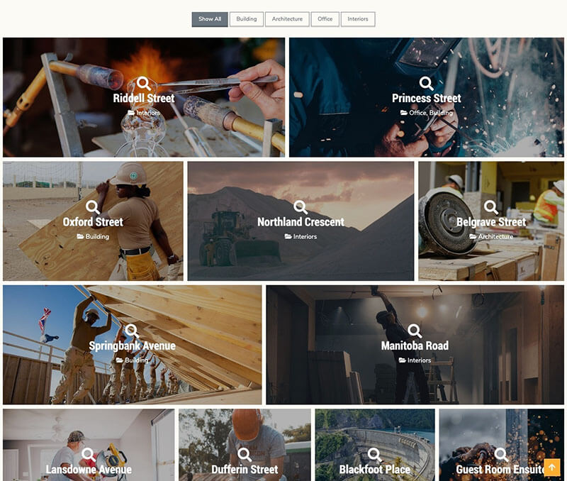
Grid style with 4 basic style will provide you a beautiful gallery with Smart Grid


A vertical masonry with a clean bottom edge

If you like the uneven brick-like look (Google Image or Flickr style), then horizontal masonry style is a good option.
Smart grids is responsive block with flexible and beautiful style. They will adapts automatically on all devices.

TZ Flex Grid supports filter by Tags & Categories of TZ Portfolio+

TZ Flex Grid inherits all lightbox feature from TZ Portfolio+ Core.
